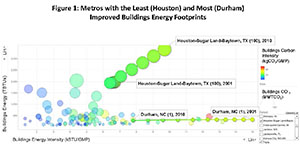
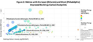
 Using "bubble charts," Figures 1 and 2 highlight the trajectory of four cities, from 2001 to 2010. The backdrop of bubbles are the 2010 energy and carbon dioxide footprints of all 100 metro areas in the U.S. Over that decade, Houston had the largest increase in its buildings energy footprints, and Durham experienced the greatest improvement. When carbon footprints are graphed, the patterns change reflecting the carbon intensity of the electricity consumed in urban areas. Orlando experienced the largest increase in its buildings carbon footprints, while Philadelphia saw the greatest improvement.These graphs reflect the importance of local action and partnerships with electric utilities, which are highlighted in greater detail in our Applied Energy paper on "Progress in Energy and Carbon Management in Large U.S. Metropolitan Areas." Energy Procedia, Volume 75, 2015, Pages 2957-2962.
Progress in Energy and Carbon Management in Large U.S. Metropolitan Areas
Date